Design Innovation Illinois
Trader Joe’s Mobile App
Timeline
Jan - Jun 2024
Team
Adaeze Asonye
Ariel Kim
Julia Eversmann
Calista Gunawan
Katelyn Nguyen
Esther Li
Role
UX Designer
Project Co-Lead
Responsibilities
Research
Prototyping
Experience Design
Context
As popular as Trader Joe’s is with their established brick-and-mortar locations, the store currently lacks a mobile app experience. My co-lead and I did a bit of research on Trader Joe’s to find out that they currently have no intentions of supporting online orders/grocery pickups, but we picked up on the cult love that fans have for Trader Joe’s and their desire for a mobile app.
Solution
My co-lead and I...
assembled a team of designers with a range of experiences
utilized primary and secondary research to explore pain points
designed lo-fi to hi-fi interactive prototypes from scratch
created a fun and interactive yet useful app concept to improve customers’ shopping experience at Trader Joe’s
Background
Constraints
This project was tied to the semester’s length, and also ran on a rigid timeline determined by upper leadership in the organization. Each project would include three checkpoint presentations with relatively standardized content in front of fellow teams and president/vice president of the club, and would receive feedback from those present.
At this point in the club’s lifespan, we also had yet to dive into trying full blown a/b testing with metrics or third-party apps’ involvement.
Presentation 1
initial research results
insight/hmw formation
Presentation 2
information architecture
lo-fi wireframes
Presentation 3
high fidelity wireframes
desires/reflections
Research
Pain Point Analysis
The team conducted an analysis of the existing Trader Joe’s website to see how they present themselves digitally and see what features seemed reasonable to translate to a mobile format. Here are some examples of parts of the website we looked at:
fearless flyer
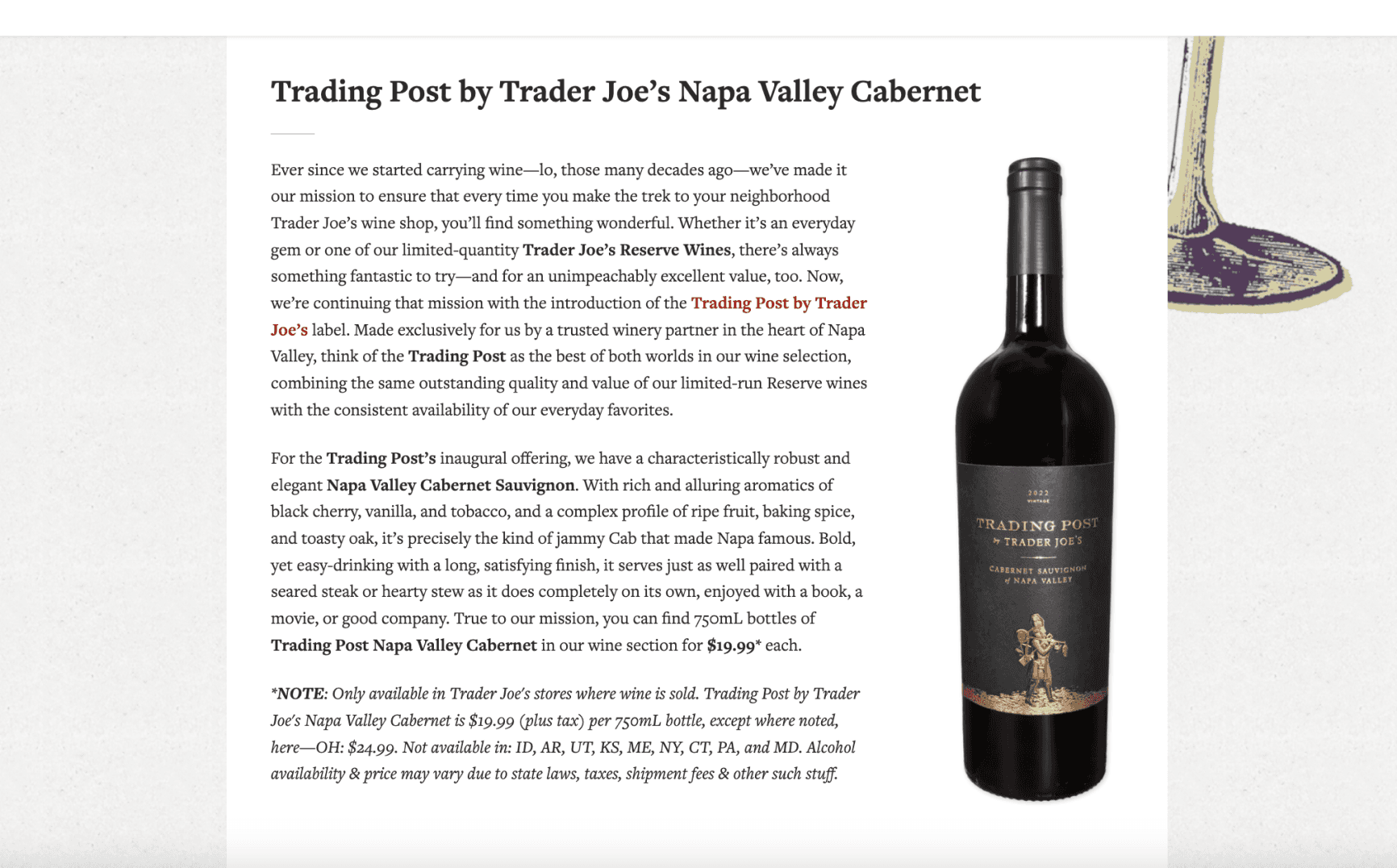
Too word dense, good way of spotlighting new/seasonal products but needs to be translated in a more interactive + mobile friendly format
recipes
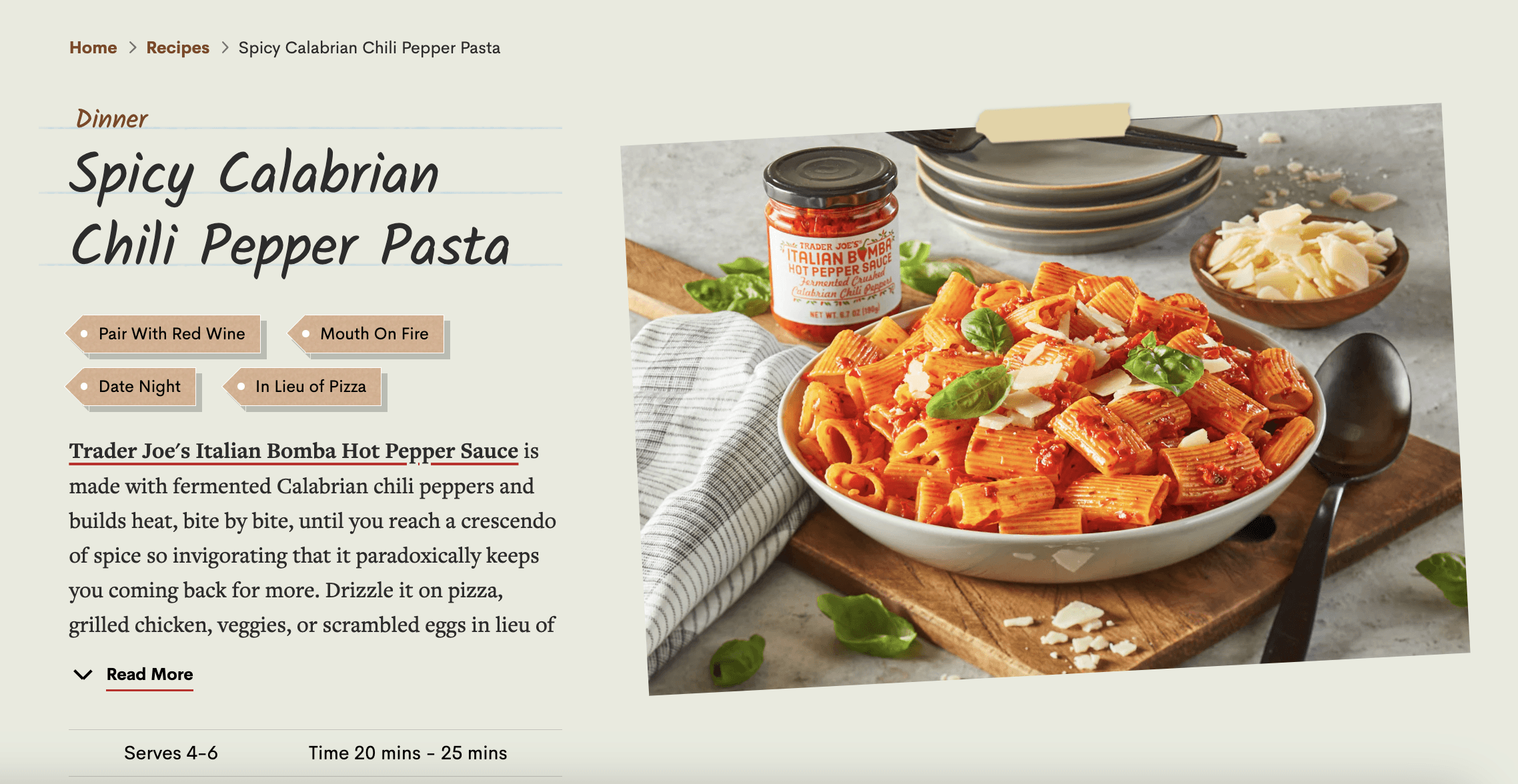
We loved this, cute way of promoting new or existing products by showing how to make dishes with them
Secondary Research
While we tried to dive right into creating question categories for the interview guide we were working on, the team quickly realized more research on Trader Joe’s was necessary. We wanted to get to know the brand as a whole better, so I directed the team to find a couple examples from the following sources of information: social media perceptions on Trader Joe’s, Trader Joe’s in the news, any additional insights of Trader Joe’s business model, etc.
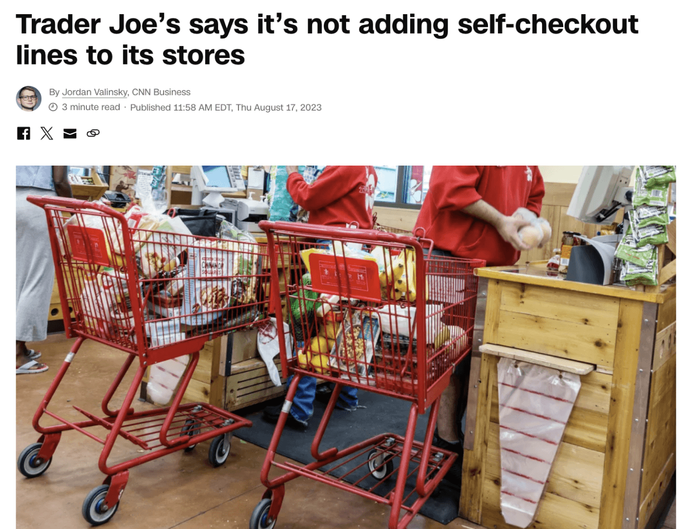
this article helped give us more insight on how important the community feel is to Trader Joe’s
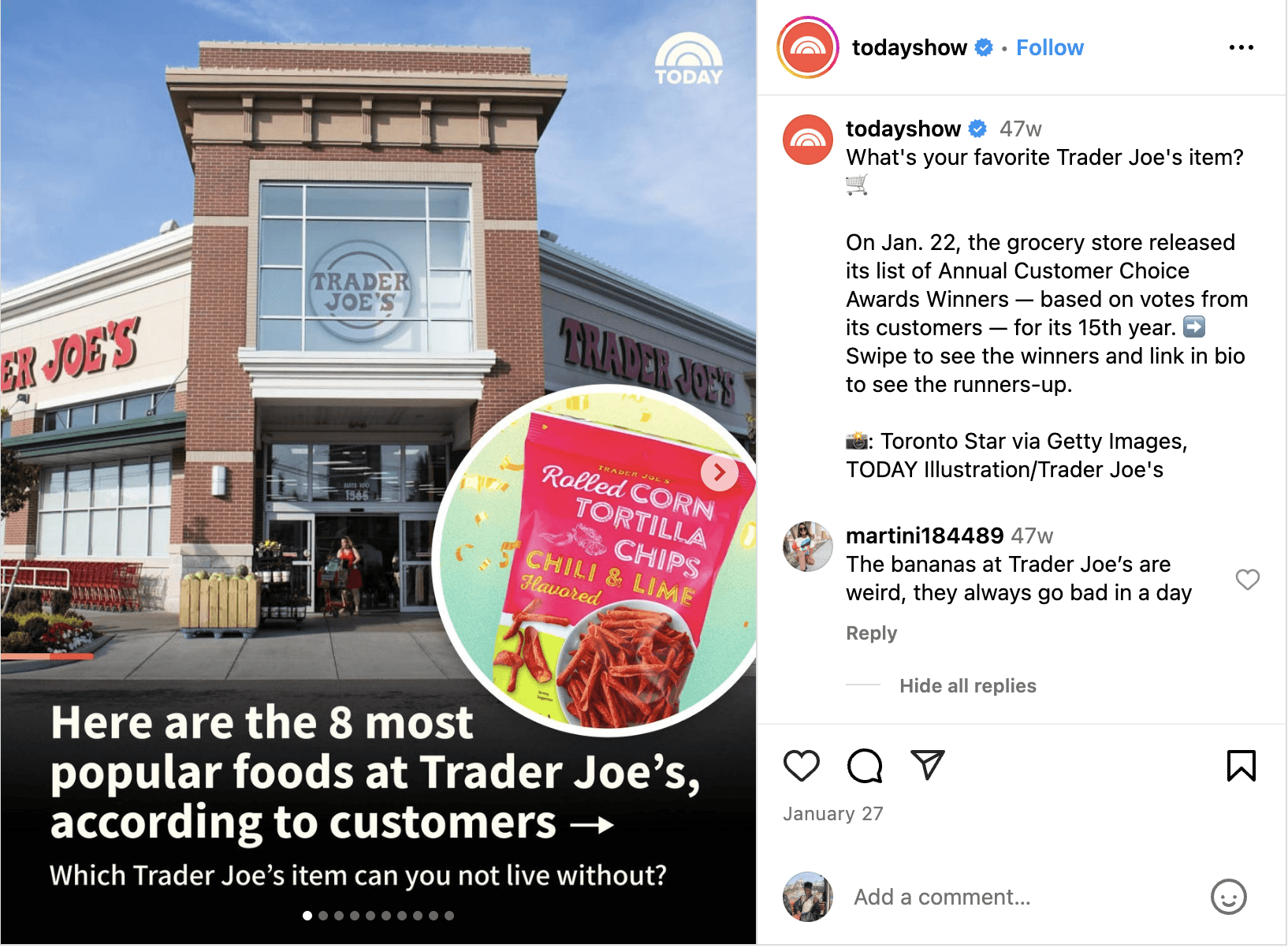
this instagram post highlighted how much people adore the unique products at Trader Joe’s
Interviews
Our team created an interview guide containing a range of questions to find out about our participants’ feelings about Trader Joes, their grocery shopping habits in general, and their opinions on the existing site after a guided walkthrough. We ended up with 26 questions in our guide, and interviewed 12 participants (8 female, 4 male).
Key Interview Categories
When shopping at TJ, how do you shop for products? Browse around or know specifically what you want?
What makes TJ feel unique to you?
Personal Experience w/ Brand
Online Experience
What grocery shopping apps do you currently use, and what features make you prefer them over others?
Have you listened to the TJ’s podcast/read the Fearless Flyer?
Website Walkthrough
What type of content on the website do you find most useful or interesting?
How well do you think the website’s design/aesthetics match the in-store shopping experience?
Affinity Mapping
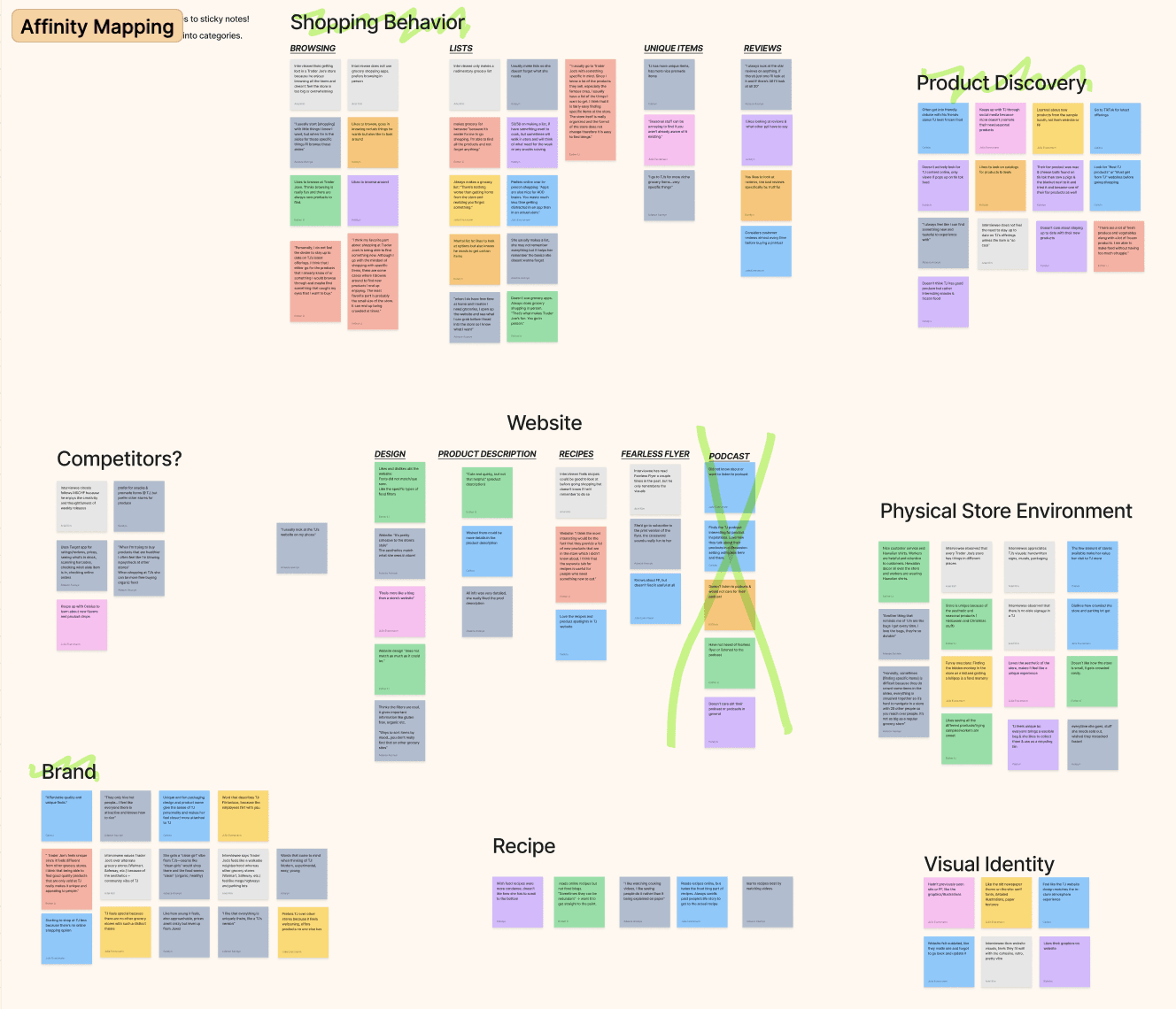
As a team, we broke down important chunks of information from our interviews and converted them to sticky notes in FigJam. We initially gave ourselves 7 minutes to group the sticky notes by similarities in order to not think too hard about the process, then took more time to solidify 6 main themes (2 of which would become insights).
Insights & HMW
Trader Joe’s Branding
Customers prefer Trader Joe’s for its quirky personality: a sense of local community and a handcrafted feel.
In-Store Experience
Although customers may have products in mind, they enjoy the treasure hunt of discovering new products.
How might we...
Create a mobile app that aids the in-store shopping experience while incorporating unique interactive elements that resonate with the TJ's brand?
Low Fidelity Wireframes
Information Architecture
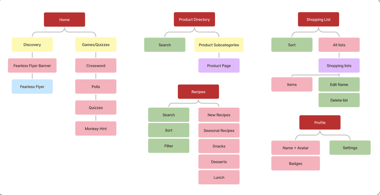
Our next step was working on our information architecture in order to make sure we were including necessary features as well as organizing them in an intuitive way. We discussed features that had been inspired from our research findings, and each created individual webs that we later combined based on discussions surrounding the optimal app layout (keeping the project’s scope in mind).
Low Fidelity Screens
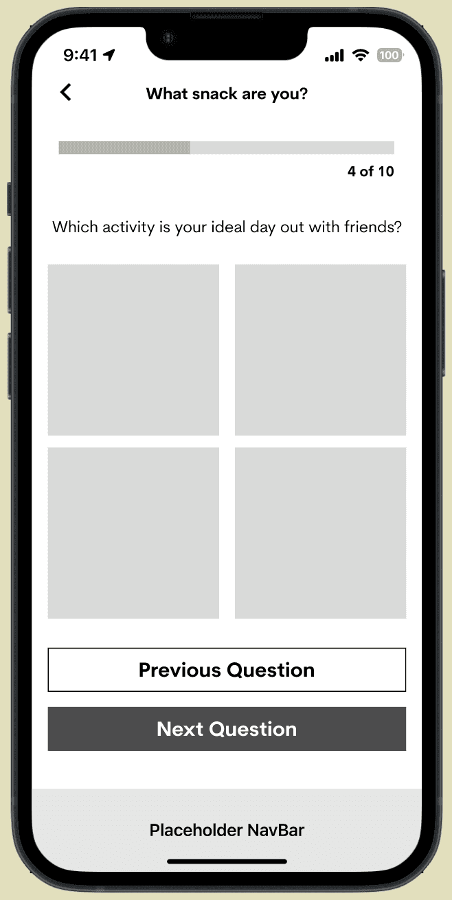
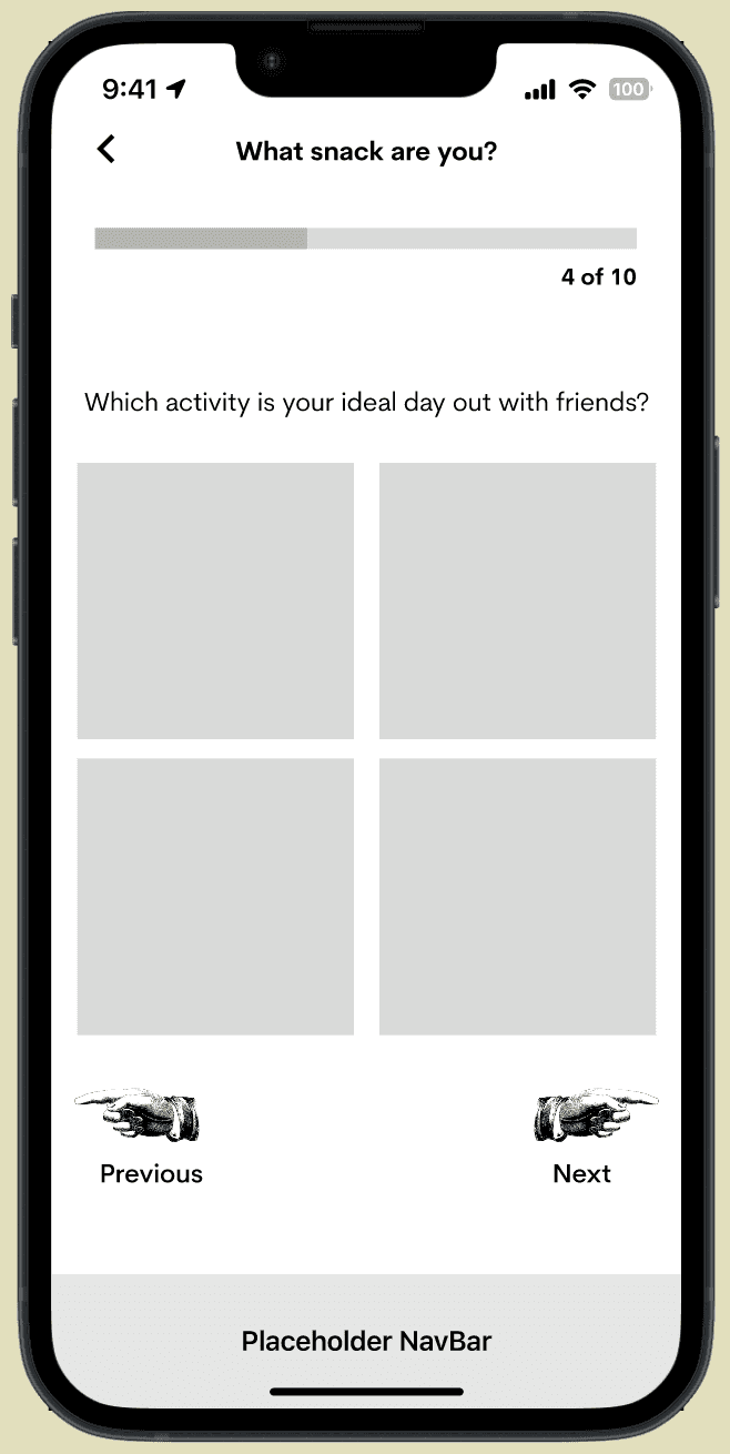
quizzes
We considered two different styles for the quiz progression: one more stylized, one more sleek and typical of a mobile app.
Based on feedback from the club, we decided to go for option one as it was more true to Trader Joe’s branding!
High Fidelity Wireframes
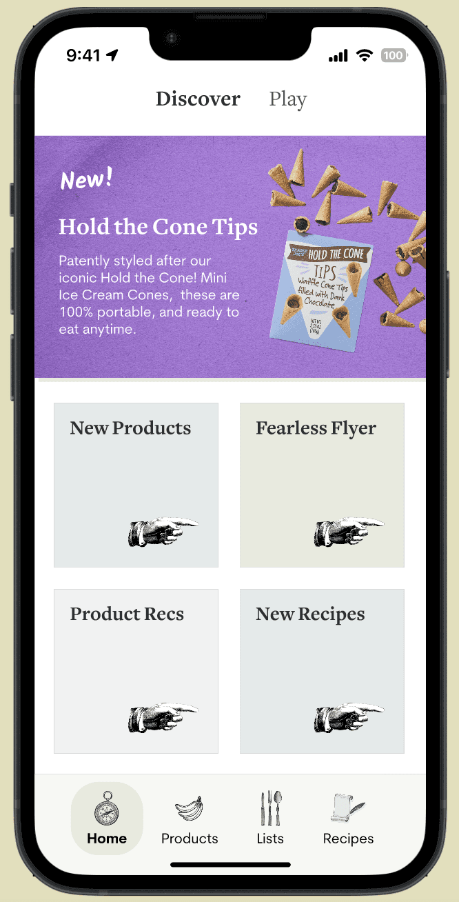
Features
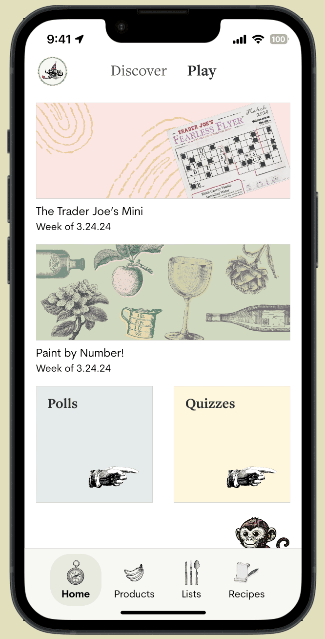
“play” tab
wanted to play off of the fun interactivity TJs emphasizes in real life like crossword puzzles included in the fearless flyer newsletter, polls to choose new items on website, and monkey hunts in store
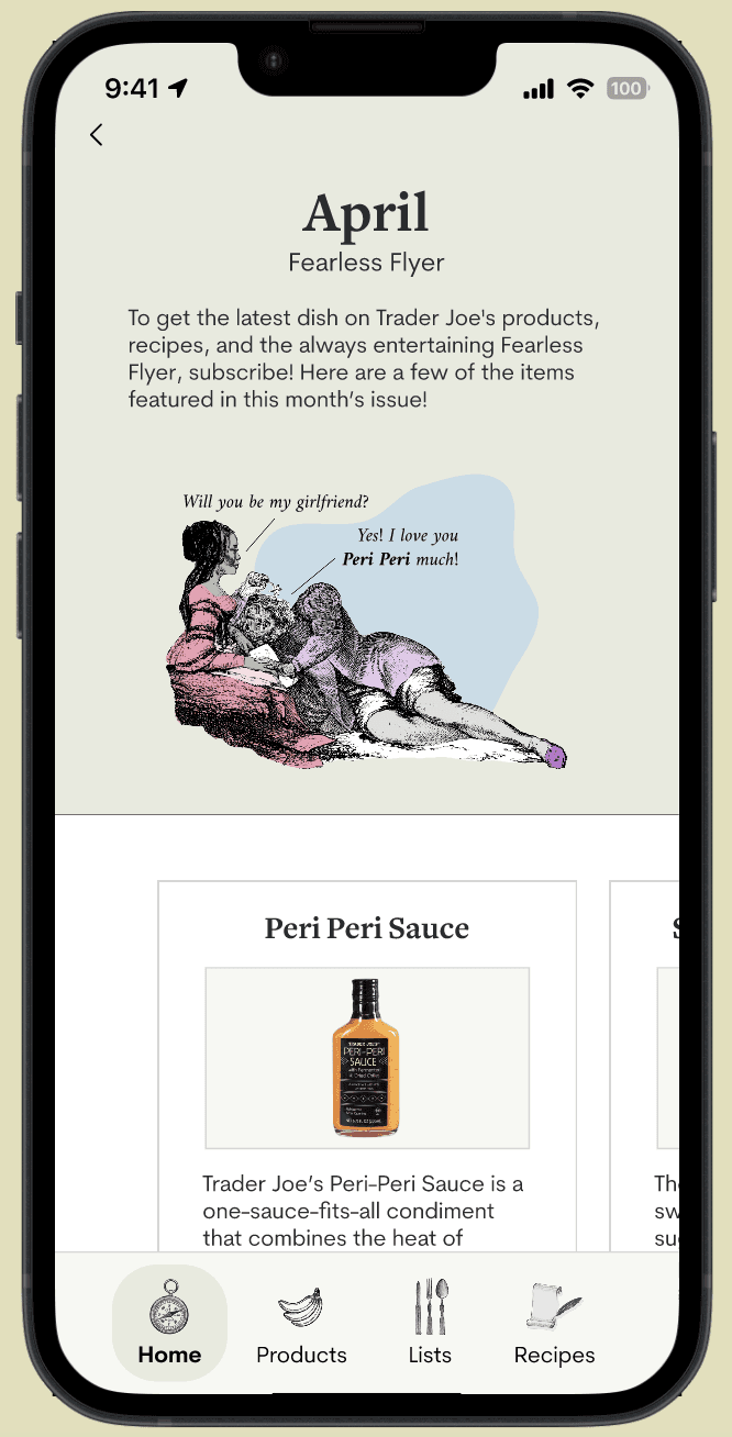
fearless flyer
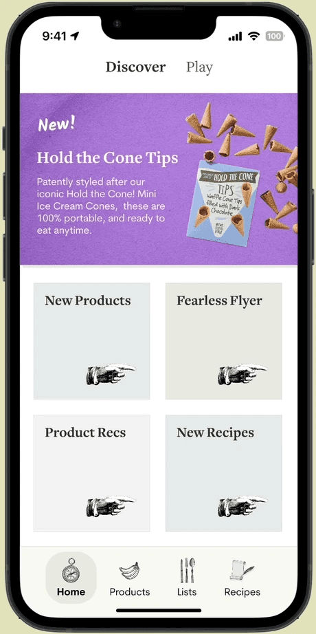

the fearless flyer is much too long to feature in full on the app, so we came up with a way to show a short preview that links to items in the app, and can sign the user up to receive the flyer in print or digitally
Additional Features
shopping lists

the website allows you to create a shopping list to keep track of things you want to buy, but emphasizes that you can’t actually buy products on the site
we added the ability to create multiple lists, can be used for different occasions or shopping trips
feature is connected to the rest of the app, items can be added from their individual pages and recipe pages
product directory (sort/filter)


we didn’t reinvent the wheel for the entire app! we brought over the ability to find new products through the search/sort/filter system from the website, which is a feature many people aren’t aware of.
Reflection
After having a few experiences being on project teams in my design organization (Design Innovation Illinois), this was my very first time co-leading a team! I remember feeling like I would never be “ready” or know enough myself to lead a team, but I was so grateful to have pushed myself because I ended up learning so much from the experience.
Design systems are KEY
Having a simple set of font styles, consistent icons, and pre-designed components really helped us work toward having a consistent design across the board.
Auto layout really is my best friend
Experimenting more with super nested layers helped so much with doing smart animations, and quickly inserting/removing elements with ease!
Keep track of the random fun ideas
We came up with so many one-off cool ideas while ideating, and while we couldn’t get to everything for scope reasons I wish we had logged everything or created a designated dump just in case we had time for any extra implementation we dreamed about in the early product stages.
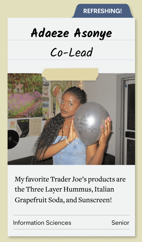
each member of the team created recipe-themed intro cards!
