
Design Innovation Illinois
Goodnotes App Redesign
Timeline
Aug - Dec 2023
Team
Adaeze Asonye
Ariel Kim
Peter Chen
Calista Gunawan
Katelyn Tran
Role
UX Designer
Responsibilities
Research
Prototyping
Experience Design
Context
GoodNotes is a digital note taking app incredibly popular with iPad notetakers, even winning Apple’s iPad App of the Year for 2022. GoodNotes has a wide range of features supporting users’ creative and practical needs that have made it successful so far, but for this project we focused on improved navigation throughout the app as well as introducing increased personalization options for users.
Solution
My team and I...
utilized primary and secondary research to explore pain points
designed from lo-fi to hi-fi interactive prototypes
redesigned Goodnotes’ interface to improve users’ ability to navigate the app efficiently and take personalization of their workspace to the next level.
Background
Constraints
This project was tied to the semester’s length, and also ran on a rigid timeline determined by upper leadership in the organization. Each project would include three checkpoint presentations with relatively standardized content in front of fellow teams and president/vice president of the club, and would receive feedback from those present.
At this point in the club’s lifespan, we also had yet to dive into trying full blown a/b testing with metrics or third-party apps’ involvement.
Presentation 1
initial research results
insight/hmw formation
Presentation 2
information architecture
lo-fi wireframes
Presentation 3
high fidelity wireframes
desires/reflections
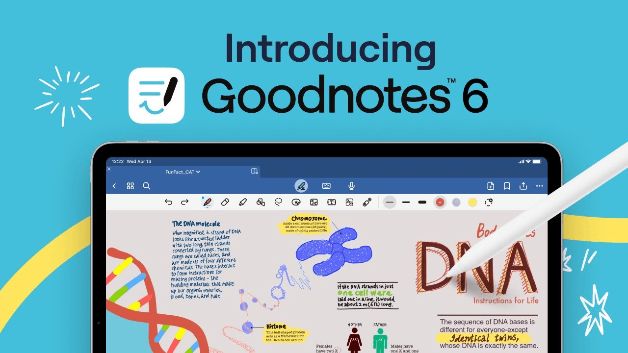
At the time that this project was conceived, Goodnotes had actually just released a complete UI update of their interface, dubbed "Goodnotes 6" + additional features.
An out of scope issue that came from this change was the fact that we found the new subscription model of Goodnotes 6 to be frustrating for users.
Research
Competitive Analysis
When looking at other note-taking apps, our investigative questions sounded like: “How do they do things? What else do they have? What do they do well? What don’t they do well?”


Utility
Organization
Ease of access
Personalization
notion
very popular for the ability to customize to your personal aesthetic through images, templates, colors, embed options, etc.
high levels of personal customization, may be a high learning curve for some
apple notes
very utilitarian, involves high-level organization systems like smart folders, tags, etc.
far fewer customization options (very minimal to no paper/template options)
Surveys/Interviews
We conducted a survey with 30 respondents, and each member of the team conducted 2-3 semi-structured interviews. With the combination of quantitative and qualitative data, we were to able to work on affinity mapping and reach some important findings that made us reconsider our initial approach!
surveys
How often would you say you use Goodnotes on mobile?
How often do you use the “Favorites” bookmark in Goodnotes?
interviews
How do you personalize your note-taking experience within GoodNotes? Are there specific templates, colors, or settings you prefer to use?
If you use or have used other note taking platforms, what separates Goodnotes from the competition? What made you pick Goodnotes as the note-taking app you use?
findings!

Platform

Marketplace

Function

Organization

Personalization

User Interface
From our research, we realized that we needed to pivot our approach of designing a mobile app after seeing multiple survey respondents + interviewees confirm that they mainly only use Goodnotes on their iPads!
Insights & HMW
Intuitive Organization
Users want an intuitive navigation system that allows them to view and switch between all their documents.
Simple Personalization
Goodnotes users like to have the ability to make their app aesthetically pleasing to them.
Users prefer simple personalization options as they value efficiency in their note-taking experience.
Streamlined Marketplace
Users do not frequent the marketplace due to its cost.
Users find the marketplace difficult to locate and difficult to navigate.
How might we...
…Empower the user to embrace their personal style while maintaining efficiency in their note-taking experience?
Low Fidelity Wireframes
Information Architecture
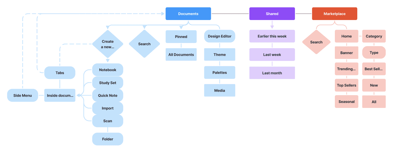
As improved navigation within the app was a big change we wanted to make with our redesign, we found it important to work together to define the main areas of the app and strip back interactions if necessary. For example, a running conversation throughout the design process was determining how many features we wanted to live in the side menu based on their relevance, versus out on the home page.
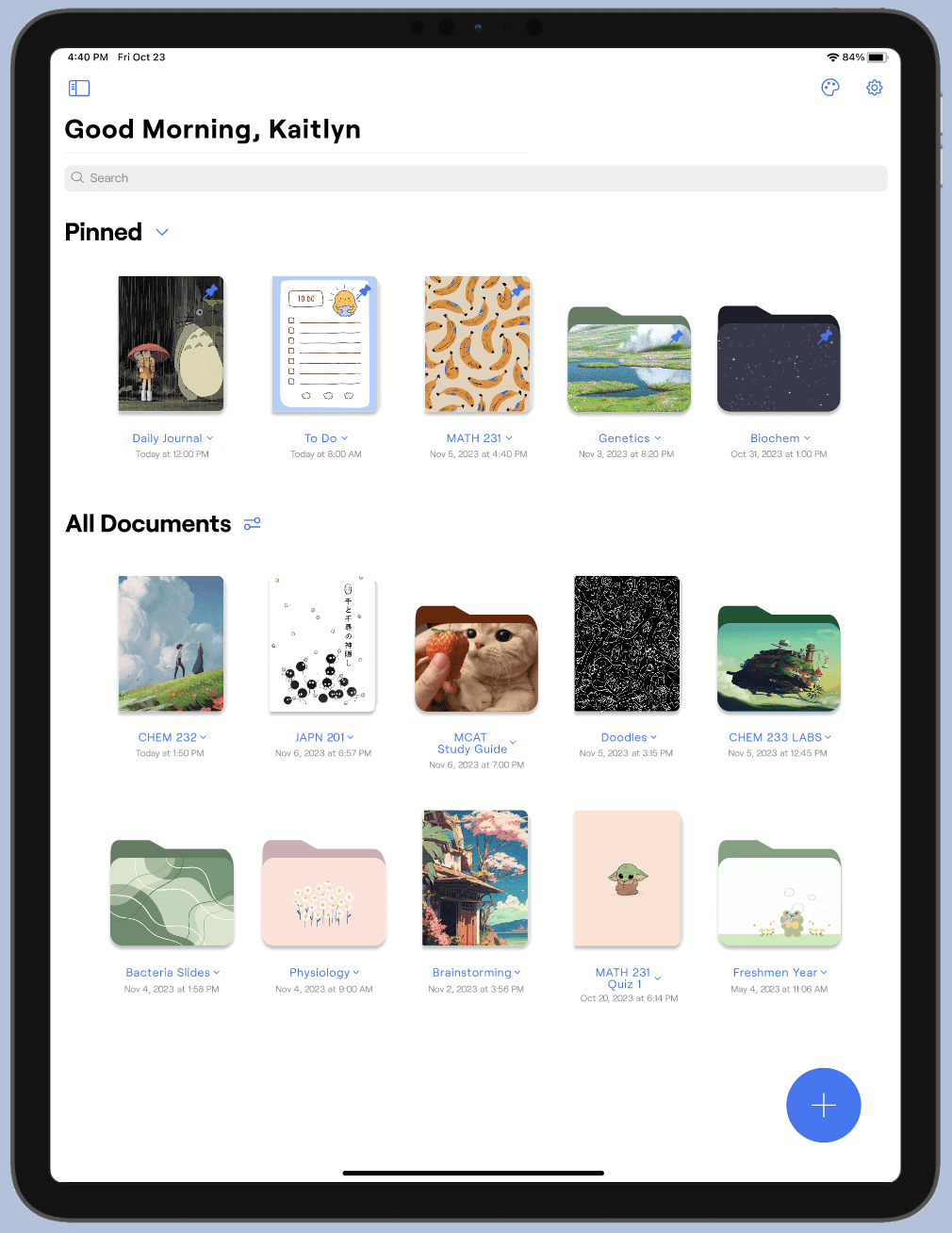
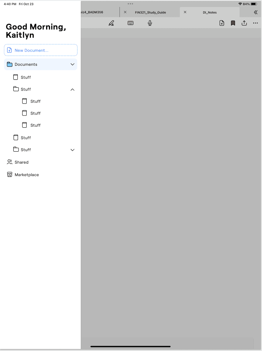
Our new three main areas of the app were Documents, Shared, and Marketplace. We decided to convert the "Search" tab into a search bar on the documents page, and convert "Favorites" to a "Pinned" section on the documents page.
Low Fidelity Screens
side menu
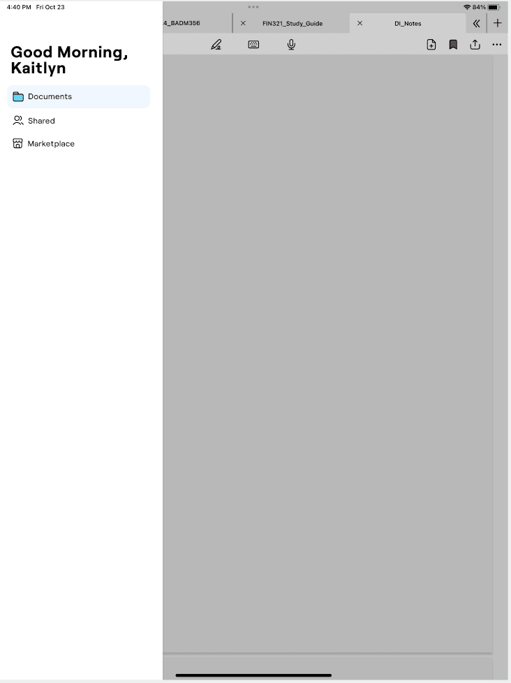
v1: simple and clean, houses the different areas of the app (documents, shared, marketplace), has new tab button in documents
v2: new doc button at top of side menu, same three areas of the app except documents is a dropdown that links directly to docs and folders from the home page, does not have the new tab button in documents
original: every main destination in the app has a button in the side menu, only accessible from outside of documents
High Fidelity Wireframes
Features
new home page

addition of pinned section to help keep important documents from getting lost
“new doc” button moved to make more space for pinned items
search bar moved to top of home screen instead of being in side bar to reduce clutter there
side menu

based on feedback we received, the v2 menu is more functional/adds to ease of navigation
v2 side menu simplifies switching between documents without always going back to the home page
design editor


completely new feature that we introduced!
three tabs: theme (workspace color scheme), palettes (color palettes that you can choose/create to use across the app), media (imported photos to use as covers across the app)
integrating a sense of personalization, but w limits
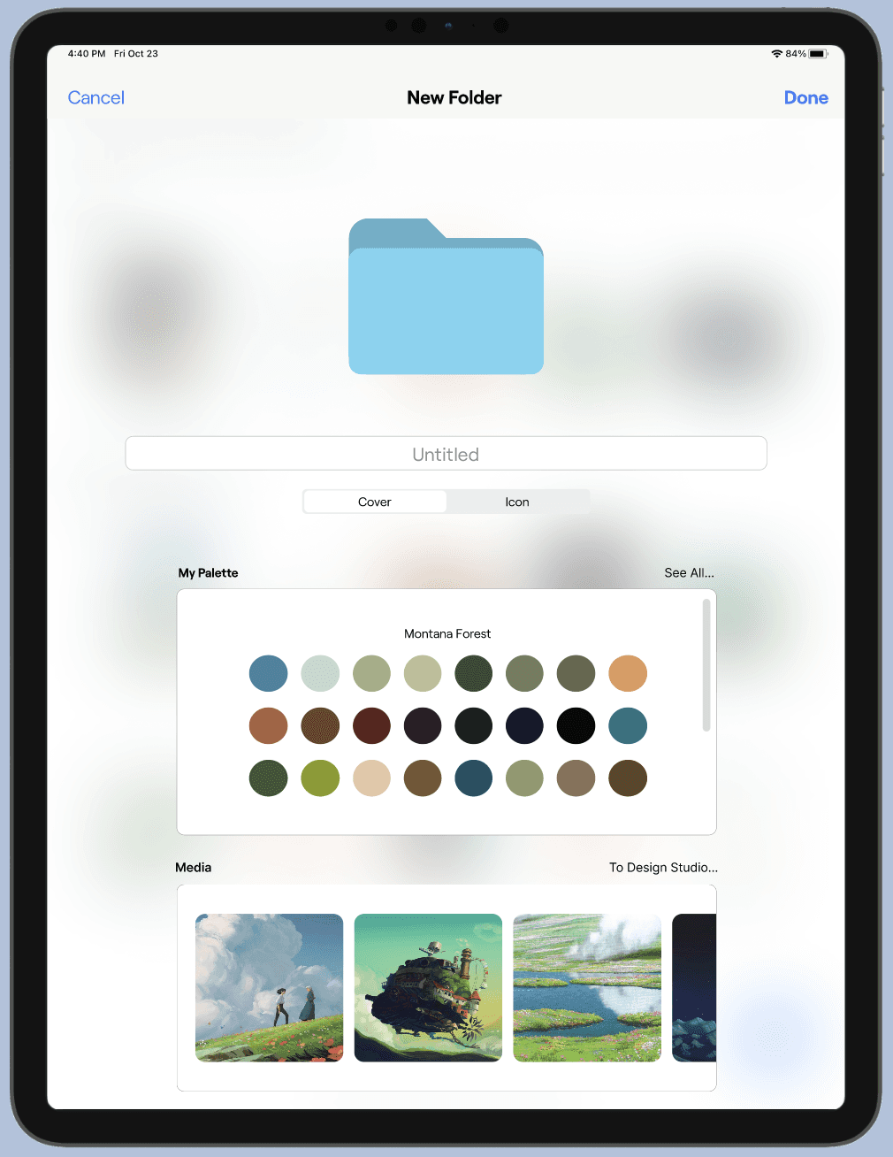
new folder
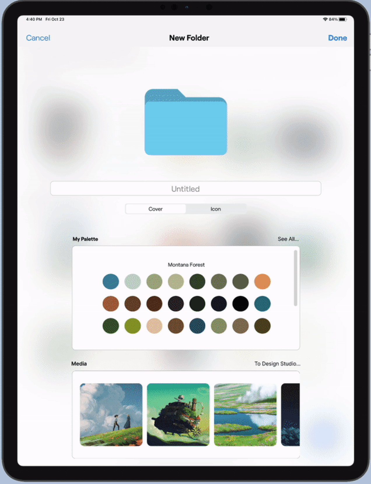
expanded the customization options already provided by goodnotes
can now choose folder cover from design editor (palettes/media)
in addition to goodnotes’ folder icons, you can now use emojis for folder icons
Additional Features


“in document”:
we added a double chevron in the top right corner to quickly collapse all other tabs while in the document view
brought in the ability to access side menu in document
ability to search all documents from the one you have open
marketplace:
added a search bar
reorganized landing page (top sellers, themed sections, etc.)
Reflection
Side menu improvements
It wasn’t until we were reaching the end of the project that we realized we could improve upon the side menu even more! To reduce clutter, we could’ve limited the side menu to:
Only pinned items
Pinned items + 5 most recent items
Trying out product testing
Even though we lack experience with formal A/B testing within the club, I definitely think it would’ve been nice to incorporate something into the project that measured the efficacy of our side menu design, as well as the opinions on the level of customization we decided to introduce.
Adaeze Asonye
each member of the team created
doodle-inspired portraits!